It’s been a long
but far out fantastic day today. I attended two sci fi-related
events: a Doctor Who celebration at the Sacramento Central Library
and then, after that, a steampunk tiki party at The Jungle Bird in
midtown. I’m much more atom punk than I am steampunk but both are
retro punk and tikis became a very heavy pop cultural icon during the
atomic era (mostly the early half of the 1960s). And I just dig
tikis! I got a collection of them—figurines, cups, etc.—in my
house. So, as I said, it was a long day and so I really didn’t get
much of a chance to work on my writing with the exception of this
blog post and some marketing of my books, The Fool’s Illusion
(which turns 4 years old this month!) and “Circa Sixty Years Dead”.
Part of marketing
one’s work involves branding that work. I’m not a business man
and so, frankly, I hate the word “branding” which is a big buzz
term in today’s age of the startup and freelance revolutions.
However, branding is probably more important now than ever. A
self-published author’s brand should be about as identifying to the
author as his/her writing style. It should identify that author as
well as the author’s work. Doing this can go a long way in
communicating to the world the existence of that work. So, as I’ve
mentioned in several posts during the summer, I’ve been putting
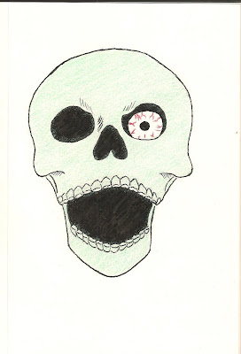
together a logo for my imprint. Although I’m still working on the
lettering for the imprint name, which is “Far Out Phantastic
Press”—a slight variation of this blog’s name, as you can
see—I’ve completed the icon:
 |
| Credit: Steven Rose, Jr. |
It will
also serve as the “O” in the word “Out” of the imprint name.
But the skull, in the way I’ve drawn and painted it
here, along with the imprint name will identify my work not just for
the dark fiction it tends to be but also for the many elements of
‘60s and ‘70s pop culture that tend to make up my writing even
though not all my stories necessarily take place in those time
periods. The style of this skull icon depicts those eras with its
simplicity, its pale green colour and the eye-ball staring out from
the one socket. The manner this skull is depicted in not only
identifies my love for ‘60s and ‘70s pop culture but also for
skulls in general. I love skulls and skeletons like I do tikis, only
a tiki icon wouldn’t depict my horror fiction as efficiently as a
skull would. I don’t write Hawaiian horror enough to use a tiki as
my imprint icon. However, that’s not to say that I never will write
that kind of horror.
Next
time, I’ll try to have the full logo, both image and imprint name,
completed and posted here.
Until
then . . . !
Comments
Post a Comment